
What is CSS Grid?
CSS Grid is a new way to create two-dimensional layouts on the web. With just a few lines of CSS, you can create a grid that was hardly possible before without JavaScript. No plugin or complicated installs, no heavy additional files, no more design limitations due to 12-columns only.
What kind of grids are possible?
In short: Actually, almost all grids that come to mind and many more. Choose the space, size and location of different grid items freely. A good overview of the most common grids with Markup can be found at Grid by Example.
And how does this work in detail?
Yes, we will talk about Sketch shortly, but even if you “only” work as a web designer, you should read on here. You don’t have to write the CSS later, but you should understand the possibilities and limitations, because otherwise the design always lags behind the technology and can never be implemented correctly. Don’t worry, it’s just a little HTML and CSS and doesn’t bite.
HTML markup for our example:
A div with the class of .container holds 5 div/items (can of course be more or less). If you like, you can experiment with the HTML and CSS markup in CodePen directly.
>
 I added some CSS styling for better understanding, not relevant for the grid
Base: Set Grid, Columns and Rows in the CSS
In the CSS, we turn the .container class into a grid by adding display:grid. With grid-template-columns we activate the desired columns, in this case 5 columns with 250px each. With grid-template-rows we can set the height of the row (if needed), in this case 150px. And that’s it, the first grid is done!
> .container{
>   display: grid;
>   grid-template-columns: 250px 250px 250px 250px 250px;
>   grid-template-rows: 150px;
> }
> /* short form: */
> grid-template-columns: repeat(5, 250px);
Setting the gutter
Any desired distance between the items can be created with grid-gap for all items or separate for horizontal and vertical distances with column-gap and row-gap. By the way you can use all common units, for example px for fixed gutters or % for flexible gutters.
> .container{
  display: grid;
  grid-template-columns: repeat(5, 250px);
  grid-template-rows: 150px;
  grid-gap: 30px;
}
Automatic distribution to the available screen area with “fr”
A designer’s dream! With Fractional Units short fr you can divide the available space according to your wishes! Here, for example, we divide the screen size into 6 parts. The first column takes 1/6 = 1fr of the space, the second column 3/6= 3fr and the third column 2/6= 2fr. You can of course also add grid-gap if you wish.
.container{
  display: grid;
  grid-template-columns: 1fr 3fr 2fr;
}
all rows flexible
px and fr mixing for fixed and flexible columns
pxand fr can be mixed in any desired way the rest will adapt to the available space. Works like a charm!
.container{
  display: grid;
  grid-template-columns: 300px 3fr 2fr;
}
first row fixed by px, remaining layout flexible
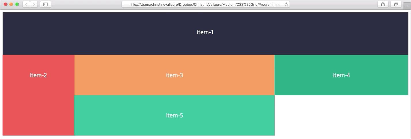
Absolute freedom of arrangement
The best thing is, all items can take up as much space as you like even within the gird! For this purpose a starting point is set with grid-column-start and the end with grid-column-end. Or in short grid-column: startpoint / endpoint;
.container{
display: grid;
grid-template-columns: 1fr 3fr 2fr;
}
.item-1 {
grid-column: 1 / 4;
}
.item-5 {
grid-column: 3 / 4;
}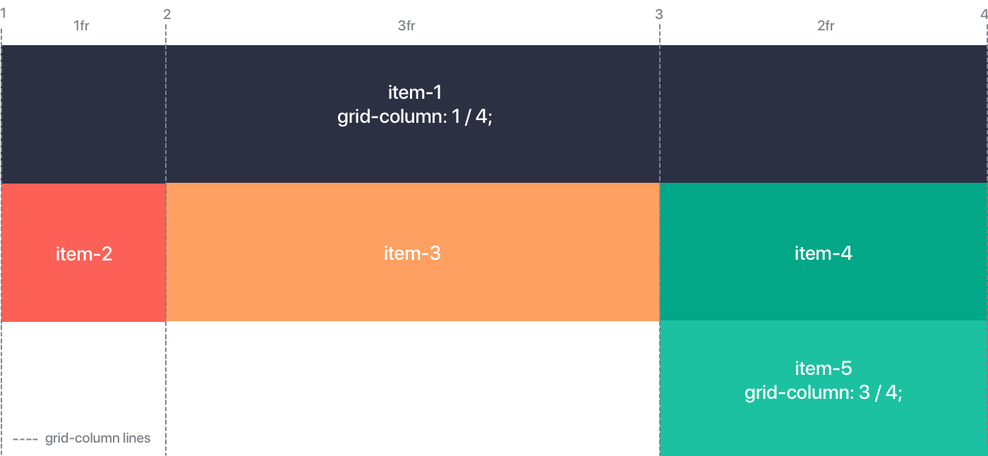 Don’t get confused by the grid lines, they start at the very beginning of the first item!
The same applies to vertical or full-area distribution!
Here CSS Grid can shine and prove its superiority over Boostrap and Co. Items can take all vertical sizes and positions with the help of grid-row. As we will see in the next example, this is an absolute advantage for adapting to different screen sizes and devices.
.container{
  display: grid;
  grid-template-columns: 1fr 3fr 2fr;
}
.item-2 {
 grid-row: 1 / 3;
}
.item-1 {
 grid-column: 1 / 4;
 grid-row: 3 / 4;
}
Any vertical width and position
Adapting to different screen sizes and devices? Of course!
Here CSS Grid also has a clear advantage over conventional grids, depending on the screen size you can not only switch from flexible to fixed elements with media queries, you can also adjust the position of entire items!
.container{
display: grid;
grid-template-columns: 250px 3fr 2fr;
}
.item-1 {
grid-column: 1 / 4;
}
.item-2 {
grid-row: 2 / 4;
}
@media only screen and (max-width: 720px){
.container{
grid-template-columns: 1fr 1fr;
}
.item-1 {
grid-column: 1 / 3;
grid-row: 2 / 3;
}
.item-2 {
grid-row: 1 / 1;
}
}
Browser support
CSS Grid is now natively supported by all modern browsers (Safari, Chrome, Firefox, Edge). With a global support of 87.85% CSS Grids are already an alternative to Boostrap and Co.
 Status: October 2018 via caniuse.com
Sounds good! And how do I set up the responsive CSS grid design in Sketch?
Pretty fast and efficient with the right folder structure and resize settings, (almost) everything works! Join in and, download the open Sketch files here.
Sketch Example 1: Flexible grid with fixed gutter:
The only trick is to arrange the elements correctly in folders, actually exactly as we would arrange it in CSS. The Gutter is fixed in width and pinned to the left while the item folder itself is only pinned to left side and can adapt freely to the screen size. Don’t forget to check “Adjust content to resize” for the whole artboard, otherwise it won’t work!


The folders (items) can now be filled with the different contents as desired. Then simply pull and drag the whole artboard larger and smaller and the CSS Grid Sketch Layout is ready and responsive. This way you can see when a breakpoint and therefore a separate layout (e.g. for mobile devices) is really necessary. Also an absolute blessing for checking font sizes!

By the way, in CSS this would be quite simple, just add this:
.container{
  display: grid;
  grid-template-columns: 2fr 1fr 1fr 1f;
  grid-gap: 20px;
}
/*or in short*/
grid-template-columns: 2fr repeat(3, 1fr);
Sketch Example 2: More complex layout with breakpoint
If you don’t want a simple grid but a “real” layout, you just have to think about the folder structure and set the resizing options for the top folders. We simply set “fixed width” for everything that should remain static, the rest is automatically flexible and can be pinned to the desired side required.

First: Create the grid with the correct folder structure and resizing settings. Here at the example desktop.


We can now fill the grid with the content (of course you should also set resize setting for items within the grid if needed. If you are unsure how that works, download the open Sketch file). This way you can easily control the view for the most common devices during the design process and see when a breakpoint is really necessary. E.g. in our example only at a width of 1000px. To hand the files over to your programming team, one selected width per artboard (e.g. iPhone8 375px width and Desktop Large 1400px width) exported in InVision or Zeplin is suffic

In CSS, by the way, that would be:
.container{
display: grid;
grid-template-columns: 1fr 350px 350px;
}
.item-1 {
grid-column: 1 / 4;
}
.item-2 {
grid-row: 2 / 4;
}
.item-3 {
grid-column: 2/4;
}
.item-4 {
grid-column: 2/3;
}
.footer{
grid-column: 1 / 5;
}
@media only screen and (max-width: 1000px){
.container {
grid-template-columns: 1fr 1fr;
}
.item-2 {
grid-column: 1 / 3;
grid-row: 4 / 5;
}
.item-3 {
grid-column: 1 / 3;
}
.item-4 {
grid-column: 1 / 2;
}
.item-5 {
grid-column: 2 / 3;
}
}
It takes a little practice and teamwork to break away from the traditional 12-column grid and get your head free for a CSS Grid based layout, but it’s definitely worth it. The new flexibility of CSS Grid finally makes it possible to deviate from generic page layouts without compromising scalability.
But it also applies here: Less is more. Because the more complex a grid becomes, the more “Tetris” it becomes in programming. In a nutshell: If your Sketch file is a nested nightmare to handle, the programming won’t feel much different when implementing the design. You should therefore take a close look at what is realistic for which project and always discuss it with the programming team beforehand.
Real life examples with CSS Grid
Slack, Company Website
Medium, right here :)
Skyler Hughes, Photography
Max Böck, front-end developer
Design+Code, tutorials for webdesigner
Hi Agency, Deck, template page
For those who want more depth
Of course there are many more tips, tricks and functions around CSS Grid that are especially interesting for front-end programmers. If you want to get a deeper insight, I recommend the detailed description of Codrops or the free online course of Scrimba, which also compares Bootstrap and CSS Grid nicely.
This article was first published on medium.com on Oct 31, 2018 and can be found here